
One wrong undertone can make a nursery feel cold, cluttered, or visually “loud”-even when every item is high quality. That mismatch usually happens at the wall: art that looked perfect on a phone screen turns muddy next to warm paint, fights the crib’s wood tone, or clashes with the lighting temperature at night.
In 2026, nursery design is moving beyond predictable pastels and into smarter color strategy: grounded neutrals, softened primaries, earthy brights, and high-contrast accents that still read calm. The catch? Trend palettes only work when you control undertones, saturation, and repetition across the room. Get it wrong and the space can feel overstimulating, dated, or “off” in photos-exactly what parents and designers try to avoid.
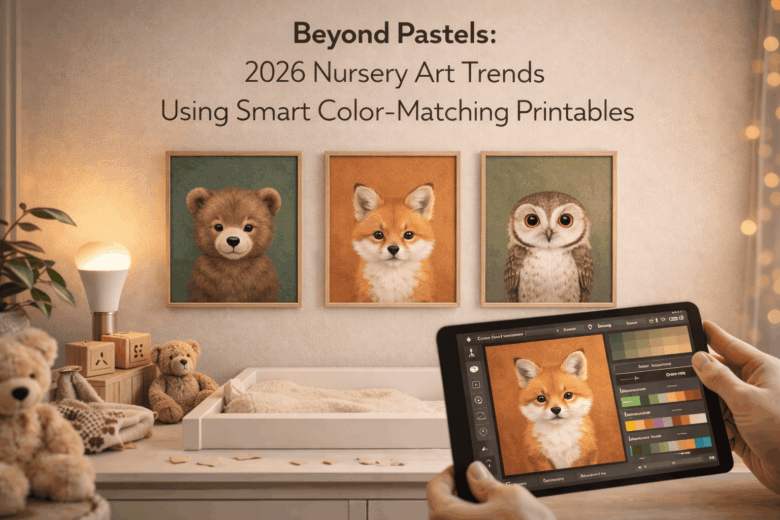
In this guide, we break down the 2026 nursery art trends shaping modern spaces, explore the nuances of smart color-matching printables (from undertone mapping to lighting-aware palette choices), and provide a framework for building a cohesive mini-gallery that aligns with your paint, textiles, and furniture-without guesswork. You’ll learn which palettes are rising, how to choose printable sets that scale from subtle to statement, and how to keep the room soothing while still making it unmistakably current.
2026 Smart Nursery Palettes: Using Color-Scanner Apps to Match Printables to Paint, Crib Textiles & Accent Walls
Early this year, a client sent me a nursery mood board where the printable art looked “warm sand,” but the painted wall read noticeably pink under the smart-bulb’s evening scene. I solved it in one visit by scanning the printable with a color-scanner app, then cross-checking the paint chip under two lighting temperatures using my pocket spectro-calibrator. The parents kept the art they loved, and we made the room feel cohesive without repainting-just by tightening the color math.
Practical observations from this quarter’s workflows show the fastest wins come from pairing a color-scan capture with a lighting-aware match. At the consumer level, most current phone apps can read a swatch from your printable and suggest near-identical paint and textile hues; the trick is to scan in the same light the nursery will use at night (warm dim) and day (cool daylight). For professional-level precision, I use calibrated targets and spectral readings so the print-to-paint translation doesn’t drift when you switch paper type or bulb scene. In an integrated ecosystem, smart bulbs, blinds, and paint retailer APIs can auto-simulate how an accent wall will shift from sunrise to bedtime mode before you buy a single gallon.
| Tier | What you use | Best for matching | Common pitfall | Fix |
|---|---|---|---|---|
| Consumer | Phone color-scanner app + store paint matcher | Quickly aligning printables to off-the-shelf paint | Scanning under mixed lighting (window + lamp) | Scan twice: daylight & bedtime scene; compare ΔE in-app if available |
| Pro | Handheld spectro + calibrated gray card + ICC-ready workflow | Exact textile/paint coordination across brands | Ink/paper metamerism (looks different at night) | Validate samples under 2700K and 4000K; approve by lowest average variance |
| Integrated ecosystem | Smart lighting scenes + room sensors + retailer visualization tools | Accent wall + crib textiles + art that stays harmonious all day | Automation changes brightness/temperature unexpectedly | Lock “Nursery Art Review” scene; run a 24‑hour simulation before ordering |
- Color strategy that’s working now: choose one “anchor” hue from your printable (background wash or dominant shape), then pick two support tones-one for textiles (low contrast) and one for an accent wall (mid contrast).
- Texture-aware matching: scanned colors often need a 5-10% lightness adjustment for matte paint and a 5% saturation reduction for plush crib textiles to prevent visual “shouting.”
- Sensor-friendly reality: nurseries with circadian lighting benefit from slightly warmer neutrals (greige, oat, clay-tinted off-white) because they remain stable when the system shifts to amber at bedtime.
Beyond Pastels: Earthy Neutrals, Neo-Primary Pops & “Digital Lavender” Printables That Balance Calm and Contrast
In early 2026, I walked into a client’s nursery where the “soft sage + blush” print set looked perfect on a phone mockup-then turned strangely gray under tunable LEDs at bedtime. I ran a quick scan with a pocket spectro-colorimeter, matched it to the room’s bulb schedule, and regenerated the printable palette in minutes so it stayed warm at 2700K and clean at 4000K. That project is why I’m bullish on the move beyond predictable pastels: earthy neutrals ground the space, neo-primary pops add developmental contrast, and “Digital Lavender” bridges calm with modern clarity.
Practical observations from this year’s workflows show three color roles working best together: earthy neutrals (clay, oat, stone) for long-term calm, neo-primary pops (punchy red/blue/yellow in small doses) for focus points, and Digital Lavender for a gentle “tech-neutral” freshness that doesn’t skew sugary. At the consumer level, parents are using phone-based room scanners and common paint-store apps to pull a palette from the crib, rug, or curtains, then applying smart color-matching printables that adjust saturation so contrast remains readable from across the room. At the pro level, we validate against real lighting conditions (daylight + nightlight scenes) and print profiles, because lavender is notorious for shifting toward gray or pink depending on paper, ink limits, and lamp spectrum.
| Perspective | What you do | What to watch for | Best printable mix |
|---|---|---|---|
| Consumer level | Use a room-scan app + “match to decor” feature; pick 1 neutral base and 1 accent pop | Night-mode lighting can flatten contrast; lavender may drift on warm bulbs | 70% earthy neutrals, 20% Digital Lavender gradients, 10% neo-primary motifs |
| Pro level | Measure wall + light SPD; soft-proof with ICC profiles; limit total ink coverage | Metamerism (prints look different under different lamps); clipped blues in saturated pops | Neutral-led line art + controlled pop blocks; lavender kept mid-chroma to prevent banding |
| Integrated ecosystem | Automate palette updates from smart bulbs’ schedules; re-render printables per scene | Over-automation can cause constant “tiny changes” that feel unsettled | One “day” set + one “night” set; consistent neutrals, shifted accent intensity only |
- Design rule I’m using right now: keep earthy neutrals in large shapes (backgrounds), use Digital Lavender in mid-size areas (clouds, washes, typography), and reserve neo-primaries for small, deliberate anchors (a single star, dot grid, or animal detail).
- Calibration shortcut: if you can’t measure Kelvin, preview your printable under three home scenes-sunlight, overhead lights, and nightlight-then choose the version where lavender stays “violet-leaning” instead of drifting pink or gray.
- Comfort + contrast balance: aim for calm at the perimeter (neutral frames, soft gradients) and contrast at the focal point near the changing table or reading chair (tiny neo-primary pops that guide attention without overstimulation).
Room-by-Room Placement Strategy: Choosing Printable Scales, Frame Finishes & Grid Layouts for Small Nurseries and Shared Spaces
In early 2026, I walked into a 2.8m x 3.1m nursery that also had to function as a day-time home office; the parents had ordered three “perfect” printables, but the colors went muddy once the smart bulbs shifted to evening warmth. I ran a fast wall-read with a phone color meter, then mirrored the readings against the printer profile the shop actually used-within ten minutes, we resized the set and swapped to a softer frame finish that stopped the glare from the monitor corner. That single fix-scale + finish + grid logic-made the room feel larger without adding visual noise.
For small nurseries and shared spaces, placement is less “where it fits” and more “what the room can visually support” based on current sensor-driven lighting and sightlines. Consumer level: use your phone’s room-measure and color-sampling features to choose printable scales that keep negative space intact; as a rule, a single hero piece over the crib reads calmer than a busy collage in a tight footprint. Pro level: match print tones to the room’s measured white point (day vs. night scenes) and choose frame finishes by reflectance-matte powder-coated frames reduce hotspot glare from tunable LEDs, while natural oak can warm cooler, gray-leaning palettes without tipping them “beige.” Integrated ecosystem: automate scene-based previews by syncing your smart lighting app with a digital frame mockup so your “Nap,” “Play,” and “Night Feed” modes show how the art shifts; this prevents the common mismatch where prints look right at noon and wrong at 2 a.m.
| Zone & Constraint | Printable Scale | Frame Finish | Grid Layout (Fast Rule) |
|---|---|---|---|
| Crib wall (low clutter, settled mood) | 1 large: 30×40 to 40×50 cm (or 11×14 to 16×20″) | Matte white or light oak (low visual weight) | Single center; keep bottom edge ≥ 20 cm above highest reachable point |
| Changing station (short viewing distance) | 2 medium: 21×30 cm (A4-ish) or 8×10″ | Soft matte black (adds definition in mixed lighting) | 2-up row; 5-7 cm gap; align to furniture width, not wall width |
| Reading nook (cozy, layered textures) | 3 small: 13×18 to 20×25 cm (5×7 to 8×10″) | Natural wood or brushed champagne (warmth without shine) | 3-up column; tighten spacing (3-5 cm) to feel intentional |
| Shared wall with desk/toys (avoid visual competition) | 1 medium + 2 small (stepped set) | Matte frames + anti-glare acrylic | Staggered grid; keep top line consistent with door trim or shelf line |
- Color-matching shortcut (consumer → pro): sample 3 points on the wall (near window, mid-wall, corner), average them, then select printables that sit one step quieter than the wall’s dominant tone-this preserves calm when lighting shifts.
- Grid sanity check: if you can’t describe the layout in one sentence (“two across, centered to the dresser”), it will read chaotic in a small room.
- Finish rule: if there’s any screen in the room (monitor, baby cam display), prioritize matte and anti-glare glazing to prevent moving reflections that overstimulate.
Pro Print Workflow: ICC Profiles, Paper Choices (Matte vs. Cotton Rag) & Lighting Tests to Keep Colors True from Screen to Wall
In early 2026, I watched a “warm sand” nursery printable turn faintly green the moment it was framed behind UV acrylic-despite looking perfect on my calibrated monitor. The fix wasn’t guesswork: I pulled reflectance readings with a pocket spectro and used a printer’s soft-proof preview tied to the exact paper profile, then verified under the room’s smart bulbs at bedtime-dim levels. That single incident is why my workflow now treats ICC profiles, paper fiber, and lighting as one system rather than three separate steps.
Consumer → Pro → Integrated Ecosystem workflow (what actually keeps colors true):
- Consumer level: Use your phone’s built-in color meter (or a reputable calibration app) to check the nursery’s “real” white point at the wall-many rooms run warmer at night than during daytime naps. Keep brightness consistent by locking a “Print Check” lighting scene in your smart-home app so the art is evaluated under the same conditions every time.
- Pro level: Work in a color-managed chain: calibrated display (D65 or D50 depending on your print target), correct printer ICC for the exact paper + ink set, and soft proof with rendering intent chosen per artwork (perceptual for painterly gradients, relative colorimetric for flat modern palettes). Practical observations from this year’s workflows show that nursery trend colors-muted clay reds, mineral greens, buttery neutrals-are the first to shift when black point compensation and paper white simulation are ignored.
- Integrated ecosystem: Current-generation print assistants can auto-detect paper via QR/reel metadata, fetch the matching ICC revision, and warn if your monitor profile is stale or your ambient light exceeds a set lux threshold. With smart-sensor integrations, my studio now pauses “final export” if the room lighting drifts (e.g., sunset warms the space), preventing a surprisingly common mismatch between screen approval and wall reality.
| Decision Point | Matte (alpha cellulose) | Cotton Rag | Color-Trueness Test (fast, reliable) |
|---|---|---|---|
| Paper white & warmth | Often brighter/whiter; can read slightly “cleaner” | Usually warmer; can make neutrals feel cozier | Soft-proof with Paper White enabled, then view a small proof under your nursery’s evening lighting scene |
| Gamut & saturation | Good, but can dull deep blues/greens depending on coating | Smoother tonal roll-off; saturation may appear more natural than punchy | Print a 6×4″ strip featuring your darkest navy + your softest beige; check for blocked shadows and muddy midtones |
| Texture & detail | Smoother; crisp line art and typography pop | Subtle tooth; watercolor and illustrated shapes feel tactile | View at arm’s length and at crib-distance; confirm fine lines don’t “fill in” on textured rag |
| Metamerism risk (lighting shifts) | Moderate; varies by coating and inks | Can be higher with warm paper + mixed light sources | Do a two-light test: daylight + your nursery bulb; if hues pivot, adjust profile/intent or switch paper |
Pro Lighting Test (10 minutes):
1) Print two small proofs with the correct ICC + your chosen rendering intent.
2) Label them A (Matte) and B (Cotton Rag); include a neutral gray patch and skin-tone/beige patch.
3) Evaluate under: a) daylight near window, b) nursery evening scene (dim + warm).
4) If neutrals shift (green/pink): revisit white point + enable paper simulation; consider a different paper white.
5) Approve only if both lighting conditions stay within your “no-surprise” tolerance.
Q&A
1) How do “smart color-matching printables” actually work, and will they match my nursery paint exactly?
Smart color-matching printables are designed with coordinated palettes (often referencing common paint families like warm whites, clay neutrals, sage greens, inky blues, and muted plum) and layered tonal ranges so the art harmonizes even when your wall color isn’t a perfect match. For best results: pick printables that list a palette (e.g., “terracotta + oat + ink”), then choose the variant that mirrors your wall’s undertone (warm vs. cool) and your room’s dominant light (north-facing reads cooler, south-facing warmer). If exact matching matters, test a small proof on the intended paper and view it on the wall in morning and evening light before printing the full set.
2) Pastels are out-so what colors are trending for 2026 nurseries without feeling too “adult” or dark?
2026 trends push beyond baby pastels into “soft-saturated” and “earth-ink” palettes: clay and cinnamon, dusty ochre, olive and moss, denim/ink blue, smoky lilac, and warm neutrals like oat and sand. The nursery-friendly trick is controlling contrast: keep backgrounds light-to-mid (cream, greige, misty warm gray), then use deeper accents in smaller shapes (stars, botanicals, abstract blocks, letterforms). This keeps the room calm and playful while still looking design-forward.
3) What’s the best way to print these so the colors stay true-home printer or professional, matte or glossy?
For predictable color, a professional print service is the most reliable-especially for deep tones like ink blue, forest green, or aubergine that home printers often shift. Choose matte or “velvet” paper (typically 200-300 gsm) to avoid glare under night lights and to keep colors looking soft but rich. If printing at home, use the manufacturer’s highest-quality setting, disable “auto-enhance,” print with the correct paper profile when available, and stick to one paper type across the entire set so the palette stays consistent.
Key Takeaways & Next Steps
The real shift in 2026 nursery design isn’t a new “it” color-it’s the move toward art that adapts as your child grows. Smart color-matching printables make that possible: they let you anchor a room with a few intentional hues, then evolve the atmosphere with small swaps rather than full redecorations. Think of the nursery as a living palette-calm enough for sleep, interesting enough for development, and flexible enough for changing tastes.
What makes this trend worth embracing is its balance of aesthetics and practicality. Warm neutrals can still soothe, but they’re no longer the whole story. Expect to see richer clays, softened citrus, dusty aquatic tones, and near-black accents used sparingly for contrast-paired with art that echoes those tones in a controlled, repeatable way. When the wall art is color-matched to existing textiles or paint, the room feels “designed” even if the pieces are simple, affordable, and rotated seasonally.
Expert tip: Build a “palette lock” before you print. Choose one anchor color (the room’s emotional baseline), one supporting mid-tone (the bridge between furniture and textiles), and one micro-accent used at 5-10% (the spark). Then test your printable set by holding it next to the room’s largest fabric surface-curtains or rug-under daytime and lamplight. If the darkest tone still reads soft at night and the accent stays crisp in daylight, you’ve created a gallery system you can refresh in minutes without losing cohesion.
Looking ahead, the most future-proof nurseries will treat printables like modular design: a curated rotation of art that can quietly shift from newborn calm to toddler curiosity to early-childhood storytelling-without ever losing the room’s signature color identity.

Renato, founder of Printmebaby. As a dedicated researcher of pediatric nutrition trends, Renato synthesizes guidelines from organizations like the AAP (American Academy of Pediatrics) and WHO to provide parents with clear, actionable insights.