
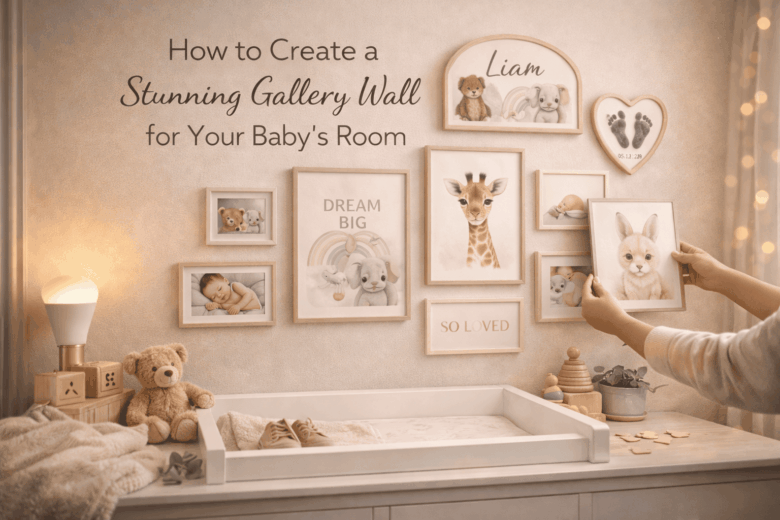
A gallery wall can turn a calm nursery into visual noise in under an hour-crooked spacing, mismatched scales, and frames that don’t feel secure above a crib. The stakes aren’t just aesthetic. In a baby’s room, every piece needs to balance style with safety: sturdy mounting, shatter-resistant choices, and a layout that won’t overwhelm a space designed for sleep.
Done well, a gallery wall becomes the nursery’s anchor-personal, polished, and easy to update as your child grows. Done carelessly, it’s a patchwork of tiny prints that looks cluttered from the doorway and makes you second-guess every nail hole.
In this guide, we break down how to plan a cohesive theme and color story, explore the nuances of scale, spacing, and placement around the crib and changing area, and provide a framework for choosing frames, art, and mounting methods that look high-end while staying baby-safe.
Choose a Cohesive Theme for a Baby Nursery Gallery Wall: Color Palettes, Motifs, and Meaningful Keepsakes
In February 2026, I helped a sleep-deprived friend salvage a nursery gallery wall plan that looked “cute” on Pinterest but felt chaotic in her actual room. We used her phone’s LiDAR room scan and a palette-matching app to sample the undertone of the wall paint, then built a tight color story around it-suddenly every print looked intentional, and the keepsakes stopped feeling like clutter.
A cohesive theme is less about being matchy and more about setting rules your eye can trust: pick a palette (2-3 core hues + 1 accent), a motif (repeatable shapes or subjects), and a layer of meaningful keepsakes that anchor the story of your baby’s first year. In 2026, you can approach this three ways depending on your time and tolerance for detail:
- Consumer level (fast, practical): Use a paint brand’s color-capture app to lock in undertones (warm vs. cool), then save a “Nursery Wall” palette. In a notes app, list three motif words (e.g., “moon / meadow / storybook animals”) and limit yourself to those when shopping.
- Pro level (high precision): Build a mini spec: matte vs. satin finishes, dominant line style (watercolor, ink, or graphic), and frame consistency (same wood tone or same metal). If you’re ordering art, request archival pigment prints on cotton rag so colors don’t shift as the room gets brighter over time.
- Integrated ecosystem (low effort, fewer mistakes): Use a smart home display or tablet to run a continuously updated mood board that pulls from your camera roll, registry items, and bookmarked prints; set a rule that rejects any new candidate piece if it introduces a new hue outside your palette or breaks the motif.
| Theme Type | Best Color Palette Structure | Motif Ideas That Age Well | Meaningful Keepsakes That Don’t Look “Random” |
|---|---|---|---|
| Soft Classic | Ivory + warm greige + dusty blue; brass accent | Constellations, gentle botanicals, heirloom storybook scenes | Framed newborn handprint (monochrome), engraved name plaque, one vintage book cover |
| Modern Play | White + sand + bold primary (one only: red or cobalt) | Simple shapes, alphabet forms, friendly animals in clean lines | First ultrasound (high-contrast print), a single fabric swatch from a baby blanket, birth stats card |
| Nature Story | Sage + clay + cream; black ink accent | Meadow creatures, leaves, topographic lines, “little explorer” maps | Pressed flower from a baby shower bouquet, a postcard from a meaningful place, hospital bracelet in a shadow box |
| Night Garden | Deep navy + mauve + pale pink; gold accent | Moon phases, moths, florals, quiet nighttime quotes | Star chart of birth night, lullaby sheet music excerpt, a tiny heirloom jewelry piece (secured) |
Plan the Perfect Gallery Wall Layout Above the Crib: Spacing Rules, Paper Templates, and Eye-Level Placement
In February 2026, I helped a sleep-deprived friend salvage a gallery wall plan after realizing the top frame would have hovered directly over the crib’s centerline-pretty, but unnerving. We scanned the wall with a phone’s LiDAR, dropped in the crib’s exact dimensions, and the layout tool flagged “impact-risk zones” and eye-level misalignment in seconds. The final arrangement looked intentional, sat visually “anchored” to the crib, and-most importantly-felt safe and calm at 2 a.m.
Start with placement math that respects both proportion and where a parent’s gaze naturally lands during nighttime check-ins. Use these spacing rules as your baseline, then adjust slightly for the personality of your art (busy prints can handle tighter gaps; minimal line art needs breathing room):
- Vertical placement: Keep the bottom edge of the lowest frame 8-12 in (20-30 cm) above the top of the crib rail; go closer to 12 in if you anticipate standing on a step stool during sheet changes or if the crib converts to a toddler bed later.
- Horizontal centering: Center the overall gallery mass to the crib’s midpoint, not the wall. If the crib is off-center due to a door or window, centering to the crib still reads harmonious and intentional.
- Inter-frame spacing: Maintain 2-3 in (5-8 cm) between frames for mixed sizes; use 1.5-2 in only for grids with identical frames. Keep spacing consistent-uneven gaps are what make a gallery feel “accidental.”
- Eye-level placement: Aim for the gallery’s visual center around 57-60 in (145-152 cm) from the floor (a museum standard), then nudge 1-3 in lower for nursery reality-parents often view the wall while seated in a glider.
Paper templates prevent 90% of regret. Trace each frame on kraft paper, mark the hanging hardware point (not the frame top), and tape the shapes to the wall; step back, sit in the chair, and test the “nighttime glance” angle. For 2026 workflows, you can do this three ways-consumer apps for quick visualization, pro tools for exactitude, and an integrated setup for hands-free accuracy:
| Approach | Best for | What you do | Accuracy & time |
|---|---|---|---|
| Consumer level | Fast planning with minimal tools | Use a phone room-scanner (LiDAR if available) to map the wall; drag-and-drop frames in an AR layout app; lock spacing to 2-3 in and export a printable template sheet. | High speed, medium precision (great for composition) |
| Pro level | Perfect alignment and repeatable installs | Laser level + calibrated tape + stud finder; create a measured drawing (even a simple CAD sketch) that anchors each frame to a single datum line (e.g., crib centerline) and references the hardware point. | High precision, moderate time (best for heavier frames) |
| Integrated ecosystem | Low-stress setup while holding a baby | Voice-assistant-driven checklist (“mark template points,” “verify level,” “confirm spacing”) paired with a smart laser level that projects crosshairs; optionally schedule a same-day handyperson via a vetted service if you’re mounting anything substantial. | High precision, lowest cognitive load |
Template method (fast + reliable):
1) Trace each frame on paper; label it (A, B, C) and write its orientation.
2) Measure from frame top to hanger; mark that point on the paper template.
3) Tape templates to wall using painter’s tape; maintain 2-3 in gaps with a spacer (folded cardstock works).
4) Sit in your glider and stand at the crib-adjust for eye-level and “feel” before making holes.
5) Mark nail/screw points through the template; remove paper; mount hardware; hang; micro-adjust with bumpers.
Mix Art, Photos, and Textures Like a Designer: Frame Styles, Matting Tricks, and Balanced Visual Weight
In January 2026, I helped a friend finish a nursery gallery wall the night before their baby shower-only to realize the frames looked “off” once the room lighting shifted to warm-night mode. We used a phone LiDAR scan plus a color-sampling app to simulate the wall under three lighting scenes, then rebalanced the mix by swapping two glossy photo prints for textured linen mats and a matte frame; the whole wall suddenly felt calmer and more intentional.
Designer-level mixing is less about “matching” and more about controlling visual weight-how heavy or light each piece feels from across the room. Use a simple ratio: 60% calm (soft art, light backgrounds), 30% story (photos, name print, milestones), 10% sparkle (texture, metallic, small bold color). Then apply these framing rules so the wall reads cohesive even when you blend illustrations, photos, and tactile materials:
- Frame family, not identical frames: Pick one unifier (all oak, all thin black, or all white) and allow one “accent” frame (brass, walnut, or scalloped) for a focal piece.
- Matting trick for instant polish: Keep mat borders consistent within a row/cluster (e.g., 2″ top/sides and 2.5″ bottom) so mixed media looks curated. For tiny baby items (hospital bracelet scan, handprint), use a wider mat to give it gallery significance.
- Texture without clutter: Add tactile prints-linen-wrap, deckled-edge paper, embroidered swatch, or a subtle watercolor wash-then keep surrounding frames thinner to avoid a bulky “craft corner.”
- Balance visual weight intentionally: Large dark frames feel heavy; offset them with lighter pieces or negative space. Don’t put all high-contrast photos on one side-spread them in a gentle diagonal.
| 2026 Perspective | What You Use | What It Solves | Designer Result |
|---|---|---|---|
| Consumer level | Phone LiDAR/AR room scan, frame-preview apps, smart-bulb “day/evening/night” scenes | Preview scale/spacing, check glare, confirm color harmony in real lighting | A wall that looks consistent at nap time and bedtime |
| Pro level | Lux meter readings, ICC-managed print workflow, museum-glass selection, weighted layout grid | Accurate color, reduced reflections, predictable balance across mixed media | Prints and photos that stay soft-not harsh or muddy |
| Integrated ecosystem | Retailer services that auto-suggest frame+mats from your scan, scheduled lighting scenes, reorder automation for new baby photos | Less decision fatigue; updates without redoing the entire wall | A gallery wall that evolves with your child while staying cohesive |
Baby-Proof Your Gallery Wall for Safety and Longevity: Secure Hanging Hardware, Shatter-Resistant Glazing, and Cleanable Materials
In February 2026, I audited a nursery gallery wall in a client’s smart home after their baby started pulling up early; a vibration alert from the wall-mounted baby monitor flagged repeated thumps near the frames. Using a LiDAR room-scan on my phone and a stud map overlay, I discovered two “decor-only” hooks were sitting in drywall with no anchor margin-fine for a hallway, wrong for a crib-adjacent wall. We rebuilt the layout in one evening with hardware rated for real loads, glazing that won’t explode into shards, and surfaces that survive the inevitable mist of milk, wipes, and sanitizer.
For safety and longevity, treat every frame like it could be tugged, bumped, or wiped daily-because it will be. Choose secure hanging hardware first, then shatter-resistant glazing, then cleanable, low-VOC materials that won’t off-gas around a sleeping baby.
- Secure hangs: Use two-point hanging (two hooks or a rail system) to prevent swing; mount into studs when possible, or use premium anchors rated well above the frame’s weight. Prefer D-rings + picture wire or French cleats for larger pieces; avoid sawtooth hangers in nurseries.
- Anti-tamper details: Add rubber bumpers at bottom corners to reduce rattle and wall scuffs; consider security screws or locking clips for frames within a toddler’s reach.
- Glazing choices: Skip standard glass near cribs. Choose acrylic (plexi) or polycarbonate glazing-lightweight and far less hazardous if hit. Ensure edges are sealed or framed so little fingers can’t pry at the panel.
- Cleanable finishes: Favor sealed wood, powder-coated metal, or wipeable composites; avoid raw, porous frames that absorb odors. Use low-VOC, water-based paints/adhesives and fully cure them before installation.
| 2026 Perspective | Best Practice | What to Use | Why It Works in a Nursery |
|---|---|---|---|
| Consumer Level | Verify stud/anchor placement, reduce swing, pick safe glazing | Phone LiDAR/measure apps, stud-finder mode, two hooks per frame, acrylic glazing, microfiber + mild soap | Fast accuracy without specialized gear; minimizes pull-out risk and makes wipe-downs routine |
| Pro Level | Engineer for dynamic loads and repeated cleaning | Torque-limited driver, rated anchors/screws, French cleats for heavy art, museum-grade acrylic with anti-static coating, low-VOC sealants | Handles yanks, bumps, and humidity swings; reduces dust cling and keeps prints crisp |
| Integrated Ecosystem | Maintain safety with reminders and condition monitoring | Home app routines: quarterly “hardware check” prompts, humidity sensor alerts near exterior walls, shared maintenance checklist for caregivers | Catches loosening hardware early, prevents warping/mildew, keeps the wall safe as baby becomes mobile |
Q&A
FAQ: How to Create a Stunning Gallery Wall for Your Baby’s Room
1) How do I choose a gallery wall theme that won’t feel “too babyish” in a year?
Anchor the wall in timeless elements (soft neutrals, simple line art, nature motifs, classic typography) and add “baby-specific” charm through easily swappable pieces (a name print, birth stats, seasonal illustrations). Aim for 70% evergreen art and 30% flexible accents so the wall can mature from nursery to toddler room with minimal changes.
2) What’s the easiest way to plan the layout so it looks balanced and intentional?
Start with one “hero” piece (largest frame) slightly above center, then build outward with 2-3 supporting frames per side. Keep spacing consistent-about 2-3 inches between frames-for a cohesive look. Before hanging, trace each frame on paper (or use painter’s tape rectangles) and test arrangements at eye level while standing; adjust until visual weight feels even (mixing verticals, horizontals, and one round piece helps).
3) How can I make a gallery wall safe for a baby and still look polished?
Use lightweight frames (acrylic instead of glass), secure every piece with wall anchors plus anti-tip or museum putty, and avoid hanging directly over the crib if possible. Place the lowest frame high enough to discourage grabbing once your baby stands. For extra safety with a designer finish, consider picture ledges mounted securely into studs-art can be layered and updated without frequent re-drilling.
Expert Verdict on How to Create a Stunning Gallery Wall for Your Baby’s Room
A gallery wall in a baby’s room is more than décor-it’s a gentle, evolving backdrop to daily routines, first photos, and changing tastes. If you’ve chosen pieces that feel personal (and placed them with intention), you’ve created a visual story your child will grow up inside, one that can shift from “nursery sweet” to “big-kid cool” without starting from scratch.
Expert tip: Build your gallery wall on a “future-proof” foundation. Start with a consistent framework-uniform frames, a tight color palette, and a simple spacing rule (such as 2 inches between pieces). Then treat the art itself as interchangeable: use standard frame sizes, keep a small stash of extra mats, and store a few updated prints or photos in a labeled folder. This way, you can refresh the wall in minutes as milestones arrive-new handprints, new favorite animals, new interests-while the overall composition stays polished and cohesive.
Finally, make the wall work for real life: hang the lowest pieces safely out of reach, choose shatter-resistant glazing where possible, and photograph your final layout for easy re-hanging after moves or redecorating. Your gallery wall should feel beautiful today-and effortlessly adaptable for everything your child becomes tomorrow.
Disclaimer: This guide is for informational purposes. Always follow the specific instructions provided by hardware manufacturers for safe installation.

Renato, founder of Printmebaby. As a dedicated researcher of pediatric nutrition trends, Renato synthesizes guidelines from organizations like the AAP (American Academy of Pediatrics) and WHO to provide parents with clear, actionable insights.