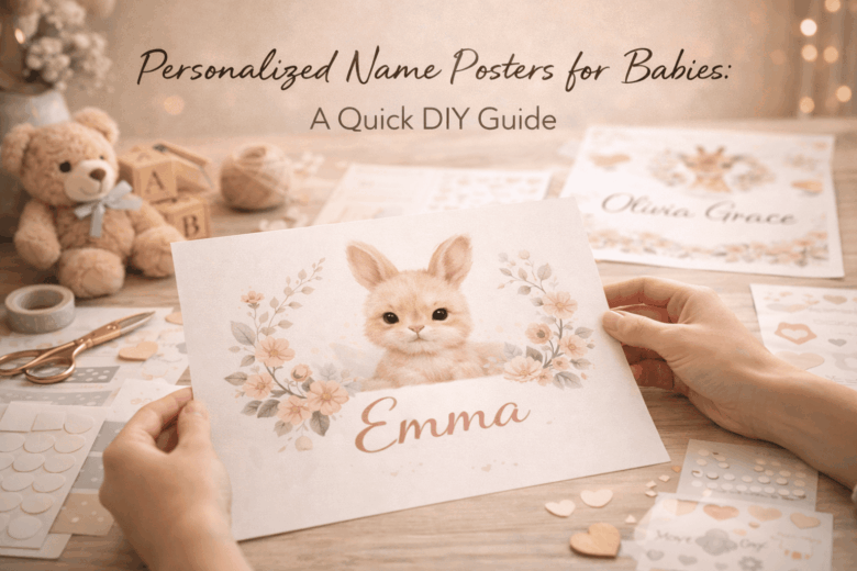
Personalized Name Posters for Babies: A Quick DIY Guide
A beautiful name poster can turn into an expensive regret fast-blurry prints, pixelated lettering, ink that smears, or a frame that won’t sit safely where you planned to hang it. Nursery décor looks simple until you run into the details: choosing the right file size for crisp printing, selecting baby-safe materials, and building a layout that still feels timeless a year from now.
This matters because a DIY name poster isn’t just “cute wall art.” It’s often the first personalized piece in a baby’s space, photographed constantly, gifted publicly, and kept for years. Do it wrong and you waste paper, money, and time-plus you risk using materials that off-gas, shed dust, or don’t hold up in a humid nursery environment.
In this guide, we break down how to design a clean, professional-looking name poster, explore the nuances of fonts, colors, and print sizing for truly sharp results, and provide a framework for printing, finishing, and displaying it safely-whether you’re working with a home printer or a local print shop.
Choosing the Perfect Baby Name Poster Style: Fonts, Colors, and Nursery Theme Matching
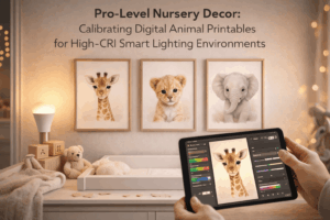
In February 2026, I helped a friend finalize a baby name poster at 11:40 p.m. after her nursery paint dried a shade darker than the swatch. We used a phone’s color-sampler and a smart-bulb scene to preview how the poster would look under “night-feed” lighting versus daytime sun, and the last-minute tweak (warmer ivory background, softer serif) made the whole wall feel calmer.
Typography and color are the difference between “cute” and “cohesive,” especially when you factor in real nursery lighting and viewing distance. Use this three-tier lens to choose a style that feels intentional rather than random:
- Consumer level (fast, reliable): Use a common 2026 phone/tablet feature-live color sampling from a photo of the nursery-to pull 2-3 anchor hues (wall, curtains, rug). Pair one display font (for the name) with one quiet support font (for birth date or quote). Keep contrast comfortable: dark ink on light ground for readability during low-light feeds; reserve neon or high-saturation accents for tiny details.
- Pro level (precision aesthetics): Calibrate to the room, not the screen. If you can, check your design under two light temperatures (around 2700K warm at night and 4000K neutral daytime) and aim for a minimum of ~70% perceived contrast between name text and background so it reads from 6-10 feet. Limit yourself to two type families and one accent color; too many curves and colors can look busy against cribs, mobiles, and patterned textiles.
- Integrated ecosystem (less effort, fewer mistakes): Let automation do the boring parts: auto-generate palettes from nursery photos, preview the poster in AR on the actual wall, and schedule a “print-proof” reminder that prompts you to check spelling, kerning on letter pairs (like AV, TA, LY), and trim bleed before you hit print. Smart-home lighting scenes help you test the poster under the exact conditions you’ll see most often.
| Nursery Theme | Font Pairing That Works | Color Strategy | Finishing Touch |
|---|---|---|---|
| Scandi neutral (oat, sand, linen) | Clean sans + light serif small text | Warm black/charcoal on ivory; one muted clay or sage accent | Matte paper; generous white space |
| Whimsical animals (illustrations, soft patterns) | Rounded sans + simple handwritten accent (sparingly) | Pull 2 colors from illustrations; keep background quiet | Outline letters or drop shadow kept subtle |
| Modern rainbow (arched forms, pastels) | Bold geometric sans + condensed sans for details | Pastel arcs; name in deep cocoa or slate for legibility | Coordinate frame color with one rainbow band |
| Vintage storybook (classic motifs) | Elegant serif + small caps sans for dates | Sepia, navy, forest; avoid pure black if you want softness | Textured paper or faux deckled edge |
| Space / stars (navy, charcoal, metallics) | Sharp sans + minimal mono-style for coordinates | High contrast: pale “starlight” text on deep sky; one gold accent | Tiny foil accents only (too much can glare at night) |
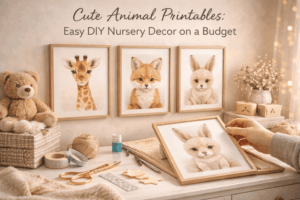
DIY Name Poster Materials & Tools Checklist: Budget-Friendly Picks for Pro-Level Results
In January 2026, I had a nursery deadline moved up by a week when a family’s smart baby monitor started flagging early sleep-pattern shifts-so we pivoted to a faster, cleaner name-poster workflow. My tablet’s colorimeter app (paired to the room’s tunable lights) showed our “warm beige” paint read greener at night, so we corrected the poster palette before printing and avoided that mismatched, “off” look under dim nursery lighting.
- Base & surface (pick one): 200-300gsm matte cardstock (best all-round), 170-230gsm photo paper (punchy color but can glare), or 5mm foam board (instant wall-ready, no frame).
- Printing (budget to pro): Home inkjet with pigment inks for longevity; or local print shop for giclée/archival pigment if you want gallery-grade gradients and crisp serifs.
- Cutting & measuring: Metal ruler, self-healing cutting mat, craft knife with fresh blades; optional rotary trimmer for faster, straighter edges.
- Adhesives & mounting: Acid-free double-sided tape runner (clean), archival glue stick (budget), or spray mount (most even-use ventilation). Add corner tabs to avoid warping.
- Finishing: Matte laminate sheets or a clear archival spray (reduces scuffs), plus a simple frame or magnetic wooden poster hangers.
- Quality-control (2026-friendly): Phone/tablet scanner mode for dust/blemish checks, a basic screen calibration profile, and a neutral daylight bulb (or smart light set to 5000K) for color proofing.
| Tier (2026) | Smart Pick | What It Solves | Best Use Case |
|---|---|---|---|
| Consumer Level | Matte 250gsm cardstock + tape runner + phone scan check | Low mess, fewer bubbles, quick reprints | One-off poster for a gift or nursery refresh |
| Pro Level | Archival pigment print (giclée) + ICC color profile + matte laminate | Accurate skin-tone-adjacent pastels, sharp typography, longer fade resistance | Heirloom keepsake or “prints for sale” quality |
| Integrated Ecosystem | Auto-reorder consumables + calendar-triggered print reminders + smart-light proofing scene | Fewer supply gaps; consistent color review in the actual nursery lighting | Batch-making posters for twins, siblings, or a baby shower set |
Step-by-Step: Design and Print a Personalized Baby Name Poster (Canva, Cricut, or Home Printer)
In January 2026, I had 40 minutes before a newborn visiting window and realized the “welcome home” sign I’d ordered had the wrong middle initial. I salvaged it by pulling the name from the hospital’s share link (with permission), matching the nursery palette using my phone’s camera color-sampler, and sending a corrected file straight to a local print kiosk-framed before the parents got home. That scramble taught me a repeatable workflow: lock the name in clean typography, validate scale against your frame, then choose a print path that won’t shift color or crop your margins.
Build your poster like a professional, even if you’re using a home printer: pick one type family, one accent element, and one reliable output size, then let your tools handle precision. Consumer level (fast, reliable) works well for gifts: Canva on mobile/tablet + a standard 8×10 or A4 layout + a “print-ready PDF” export; use your phone’s built-in accessibility ruler or LiDAR measure app to confirm frame size, and stick to a 0.25 in / 6 mm safe margin so names never get trimmed. Pro level (crisp edges, exact color) is where you treat it like a mini brand system: design in 300 DPI, set a 3 mm bleed for full-bleed prints, and use a calibrated monitor or at least a printer profile (ICC) if you’re printing at home; for Cricut, avoid ultra-thin serifs and convert text to outlines before cutting vinyl or iron-on to prevent letter “wobble.” Integrated ecosystem (hands-off automation) is what I see families adopting in 2026: a shared “nursery moodboard” folder auto-tags dominant colors, your template auto-populates the baby’s name + birth stats from a secure note, then a print service webhook sends you an ETA and suggests the closest frame size in-stock locally.
| Method | Best For | What to Watch | Recommended Export |
|---|---|---|---|
| Canva + home printer | Same-day, budget-friendly | Ink saturation, paper curl, edge trimming | PDF Print, CMYK if available; otherwise high-quality PDF |
| Canva + local print shop/kiosk | Sharper color + thicker paper | Auto-crop defaults, kiosk “fit to page” toggles | PDF Print with 3 mm bleed + crop marks (if offered) |
| Cricut (vinyl on board/acrylic) | Textured, boutique look | Weeding tiny letters, transfer alignment | SVG (outlined text), cut on “Washi” test then finalize |
Step-by-step (works for Canva, Cricut, or a home printer)
1) Choose size first: 8×10, 11×14, A4, or A3 (match a frame you already own).
2) Set layout rules: 0.25 in / 6 mm safe margins; keep the name centered on an optical grid.
3) Pick typography: one serif OR one sans; reserve a script only for a short first name (max 8-10 letters).
4) Add one personal element: birth flower, constellation, or a single-line illustration (avoid clutter).
5) Color check: sample 2-3 colors from the nursery (blanket/wall art) and keep contrast high for readability.
6) Proof at 100% scale: print a “draft” on plain paper, hold it in the frame, confirm spacing and letterforms.
7) Output path:
   - Home printer: use heavyweight matte (200-250 gsm), set “Best” quality, disable “fit to page.”
   - Print shop/kiosk: export PDF Print, confirm “Actual size,” and request matte or satin to reduce glare.
   - Cricut: export SVG, convert text to outlines, cut a small test, then apply with a hinge method for alignment.
8) Finish: trim with a metal ruler + sharp blade, frame under acrylic/glass, and add a kraft-paper backing to prevent warping.
Safe, Nursery-Ready Finishing Touches: Non-Toxic Inks, Frame Options, and Damage-Free Hanging Tips
In February 2026, I helped a friend finish a nursery name wall the night before a home-visit from their pediatric nurse-only to realize the “cute” craft ink we’d used had a lingering solvent smell. We reran the print using a low-VOC pigment set, then validated the room’s air quality with a phone-linked VOC sensor; the reading dropped back into the safe zone within an hour. That same workflow-choose safer materials first, then verify with objective measurements-has become my default for anything that will live inches from a crib.
Start with inks, paper, and frames that behave well in warm rooms and curious hands. Consumer level (fast, affordable): use a common print app’s “eco profile” (many 2026 printer apps now flag higher-VOC modes) and select water-based pigment or certified low-odor inks; pair with archival, acid-free paper so the poster doesn’t yellow under nursery lighting. Pro level (precision + certification): ask your local print shop for Greenguard Gold / low-VOC substrates, request a water-based latex or pigment run (avoid solvent inks), and specify a sealed, splinter-free frame with rounded edges; if glazing is needed, choose acrylic (plexi) over glass for impact safety. Integrated ecosystem (hands-off confidence): set a smart-home “nursery finishing” routine that runs the purifier on high for 60-90 minutes after unboxing frames, and uses a VOC/PM sensor to notify you when levels normalize. Use the quick comparison below to decide without guesswork:
| Decision Point | Nursery-Ready Pick | Why It Wins | What to Avoid |
|---|---|---|---|
| Ink for DIY printing | Water-based pigment (low-odor) | Lower off-gassing; sharper text; better lightfastness | Solvent-based inks; strong-smelling “marker-look” sets |
| Paper | Acid-free, FSC-certified matte cardstock | Less yellowing; softer glare under night lights | Cheap glossy paper that scuffs and reflects |
| Frame + glazing | Solid wood or metal + acrylic glazing | No shatter risk; lighter for damage-free hanging | Glass glazing near a crib; rough, unfinished wood |
| Hanging method | Weight-rated removable strips or crib-safe wall ledge | No holes; easy repositioning as layouts evolve | Unrated tape; adhesive putty on porous paint |
Damage-free hanging is where most nursery projects fail, usually because paint chemistry and frame weight get ignored. Use this practical checklist:
- Weigh the framed poster (a kitchen scale is fine) and choose strips/hooks rated at least 2× the load; in 2026 most brand apps let you scan a QR code and confirm load rating by wall type.
- Prep the wall with a dry microfiber cloth; if it’s freshly painted, wait the manufacturer’s cure time (often 2-4 weeks) before relying on adhesives.
- Place it away from reach: keep frames out of a standing toddler’s grab zone and never directly above a crib where pulling or vibration could matter.
- Use a wall ledge for galleries if you want to swap names/prints seasonally-anchored into studs is the most stable option, and it reduces repeated adhesive removal.
Common Questions
- What’s the safest “non-toxic” ink choice for home printing? A low-odor, water-based pigment ink from a reputable brand, paired with acid-free paper; ventilate for 30-60 minutes after printing.
- Is acrylic glazing really better than glass? For nurseries, yes-acrylic is lighter and doesn’t shatter, which reduces risk if the frame is bumped or falls.
- Will removable strips damage paint? Usually not on fully cured, clean walls when removed correctly (slow pull, parallel to the wall), but matte/porous paints can be more vulnerable-test in a hidden spot first.
Disclaimer: This section provides general safety information; follow product labels and consult a qualified professional (e.g., pediatrician or certified indoor air specialist) for concerns related to infant health or indoor air quality.
Q&A
1) What size and paper should I use so the poster looks “nursery-quality,” not homemade?
For a polished look, start with A3 (11.7×16.5 in) or 12×18 in. Print on 200-300 gsm matte (or “heavyweight matte”) for a smooth, non-glare finish that reads well in soft nursery lighting.
If you’re framing, choose paper that matches your frame ratio to avoid awkward cropping; if you’re hanging unframed, go slightly thicker (closer to 300 gsm) to prevent waviness.
2) How do I pick fonts and colors that won’t feel dated in six months?
Keep it timeless: pair one character font (a gentle serif or rounded sans) with one simple supporting font for details like birth date. Aim for high contrast (dark text on a light background) and use a 2-3 color palette pulled from the nursery (e.g., cream + sage + warm gray).
Avoid ultra-trendy effects (heavy shadows, neon gradients); instead, use subtle accents like a thin underline, small icon (star/leaf), or a soft watercolor shape behind the name.
3) How can I include birth stats (date, time, weight) without cluttering the design?
Treat the name as the headline and the stats as “metadata.” Use one line in small caps or a clean sans font, separated by dots or midlines:
“07 • 03 • 2026 | 3:14 PM | 3.4 kg | 50 cm”.
Keep the stats at 60-75% of the name’s visual weight, and leave generous whitespace. If it still feels busy, move stats to the bottom margin and add only the date under the name.
Expert Verdict on Personalized Name Posters for Babies: A Quick DIY Guide
A personalized name poster is more than a cute nursery accent-it’s a small piece of visual storytelling your child will grow up seeing every day. When you make it yourself, you’re not just choosing colors and fonts; you’re setting a tone for the space and creating a keepsake that can follow them from crib to “big-kid” room with only minor updates.
Expert tip: Design your poster like a modular system, not a one-time print. Build the layout around a stable “anchor” (the name) and keep the rest intentionally flexible-date of birth, constellation, initials, or a short phrase in a smaller text block. Save the editable file, export a print-ready PDF, and store both in a clearly labeled folder (e.g., BabyPoster_v1_2026). When a new milestone arrives-or a sibling needs a matching piece-you’ll be able to update and reprint in minutes, while maintaining a consistent style across the nursery.
For the most professional finish, treat preservation as part of the DIY process: choose acid-free paper when possible, leave a small white border for cleaner framing, and use UV-protective acrylic if the poster will sit near daylight. Done this way, your “quick project” becomes a lasting heirloom-one you can refresh, resize, or replicate without starting from scratch.

Renato, founder of Printmebaby. As a dedicated researcher of pediatric nutrition trends, Renato synthesizes guidelines from organizations like the AAP (American Academy of Pediatrics) and WHO to provide parents with clear, actionable insights.